Research language
Model codes, anomalies, and emissions pathways are meaningful to specialists, but they are not how most people ask about their future.
A climate map of Bangladesh that helps people understand what changing temperatures, rainfall, and extreme weather could mean for the district they call home.
Explore the case study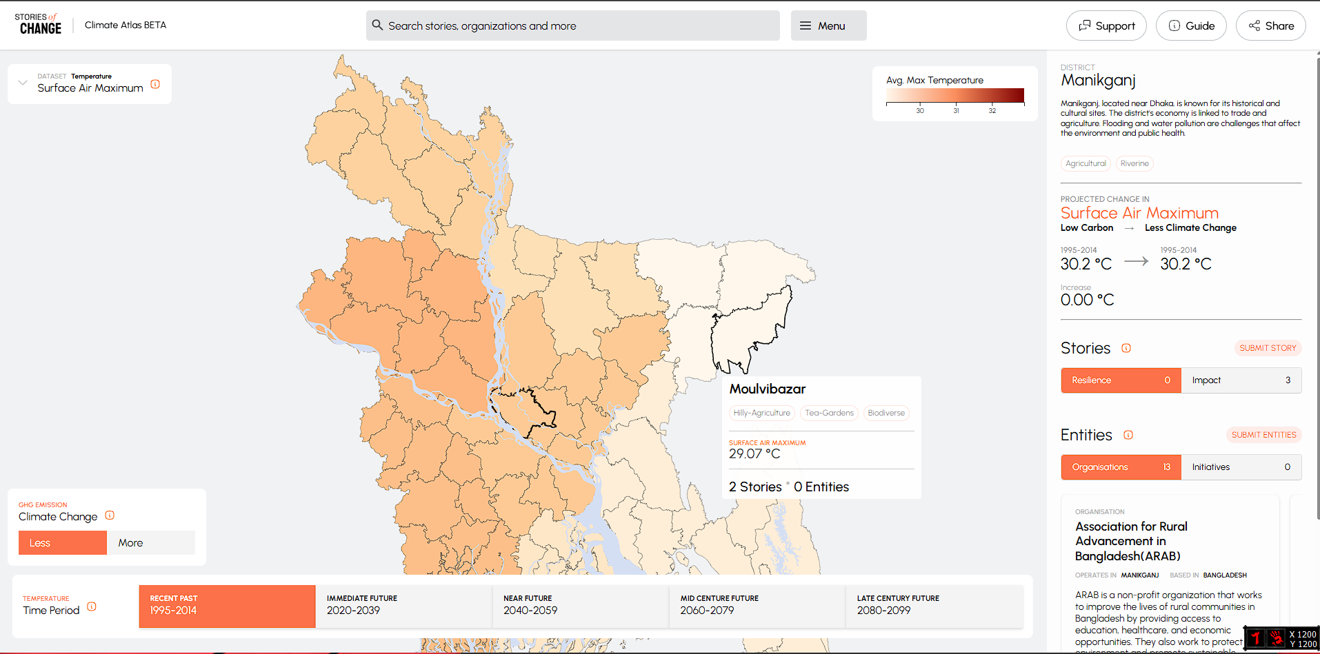 Open full product view ↗
Bangladesh already had climate projections, reporting, and directories of organisations. The problem was that they lived in separate files and used research language that did not answer the public's simplest question: what does this mean for my district?
Model codes, anomalies, and emissions pathways are meaningful to specialists, but they are not how most people ask about their future.
Projections, reporting, and organisation directories lived in different sources with no shared way to explore them by place.
Colour alone cannot explain what a changing climate means for livelihoods, communities, or the people already responding.
The interface hides the model vocabulary until it is useful. A reader chooses what they care about, a period, and an emissions future.
Choose heat, temperature, rainfall, or extreme-weather indicators.
Move from the recent past through five clear twenty-year periods.
Compare a lower-carbon future with a higher-emissions pathway.
Hovering gives a quick answer. Clicking opens the full local view: baseline, projected change, stories, and organisations—without leaving the map.
View the full atlas screen ↗A reader selects what, when, and how severe, then opens a district to see its projection beside relevant stories and organisations.
The district connects four kinds of evidence. That simple product decision turns a data catalogue into a path from awareness to action.
The district is placed on one honest colour scale and compared with its baseline.
A short district profile explains the local economy, landscape, and exposure.
Relevant journalism shows how climate pressure is already being experienced.
Organisations and initiatives make the map a starting point, not a dead end.
The atlas turns a national data catalogue into a local question. A reader can choose a district, see its projected change, then immediately find the journalism and organisations that explain what is already happening there.
A recognisable place replaces a model catalogue as the starting point.
Reporting can be discovered beside the projection it helps explain.
Organisations and initiatives sit beside risks instead of in another directory.
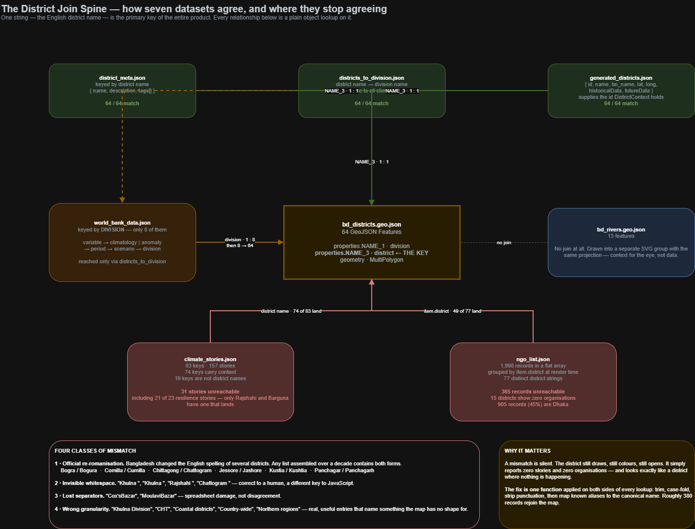
The interface works across all 64 district shapes, but contributed story and organisation records span years of spelling changes, punctuation, and mixed geographic levels. The audit records the gap instead of hiding it.
Core district geometry, climate mapping, district descriptions, and generated projections agree on the same place names.
A shared alias and normalisation layer can recover story and organisation records that currently fail to join to the map.
Some World Bank values are division-level and fan across district shapes. That geographic resolution should be explicit in the legend.
Deep links are the next useful step so a reader can share the exact district, variable, period, and pathway they selected.
The important decisions are visible in the reader experience: clearer language, stable comparisons, fast interaction, and honest limitations.
People recognise districts before they recognise model variables. Organising the experience around place made the research immediately personal.
Each climate variable keeps a fixed colour range across time periods, so switching years does not quietly change what the colours mean.
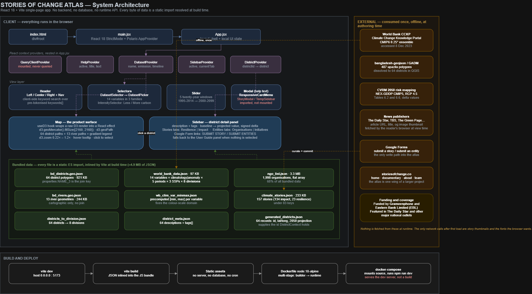
The data ships with the application and search runs in the browser. There is no database or runtime API to fail, though corrections require a rebuild.
District names came from different years and sources. Reconciliation exposed about 380 story and organisation records that still need aliases instead of silently pretending the data is complete.
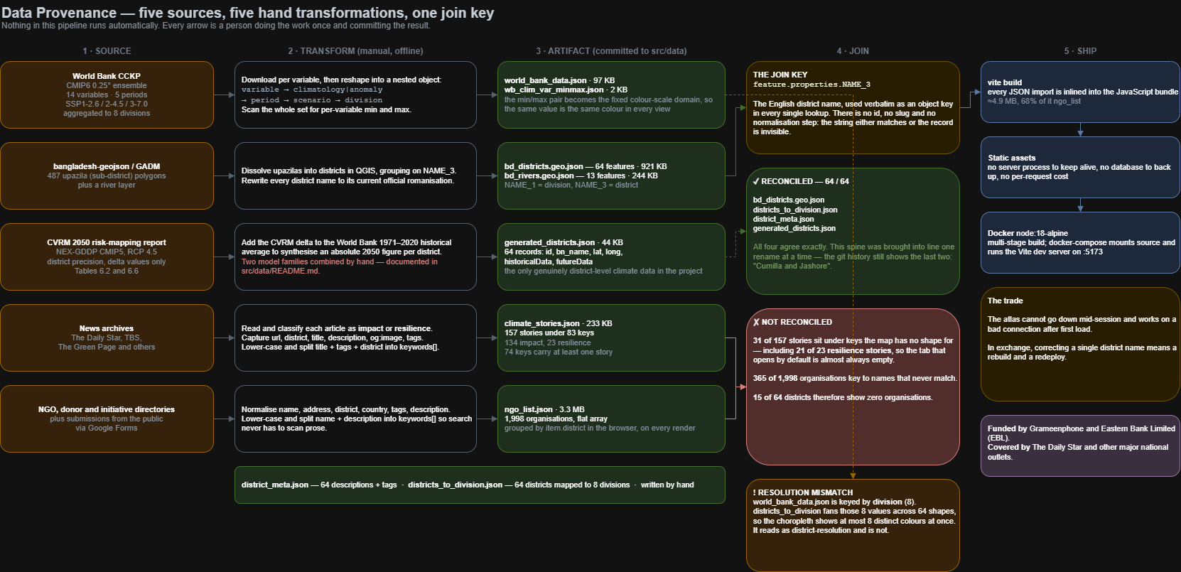
These diagrams are here for technical reviewers. Open any view at full resolution to inspect the application, source lineage, data joins, state ownership, and reader interactions.
 Open diagram ↗
The complete application: React and D3 render a browser-only product from data prepared and committed at authoring time.
 Open diagram ↗
Where the atlas gets its evidence: five different source families are cleaned, reshaped, joined, and shipped as static assets.
 Open diagram ↗
The data-quality spine: four core datasets reconcile across all 64 districts, while the audit makes unmatched contributed records visible.
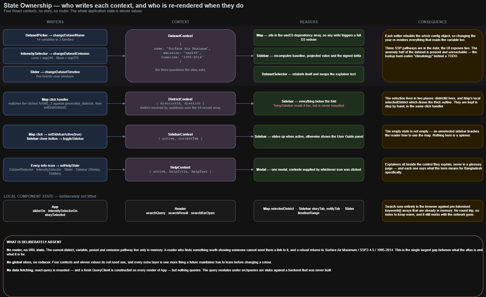 Open diagram ↗
How the interface stays coherent: each reader action has a clear owner and a predictable set of views that update.
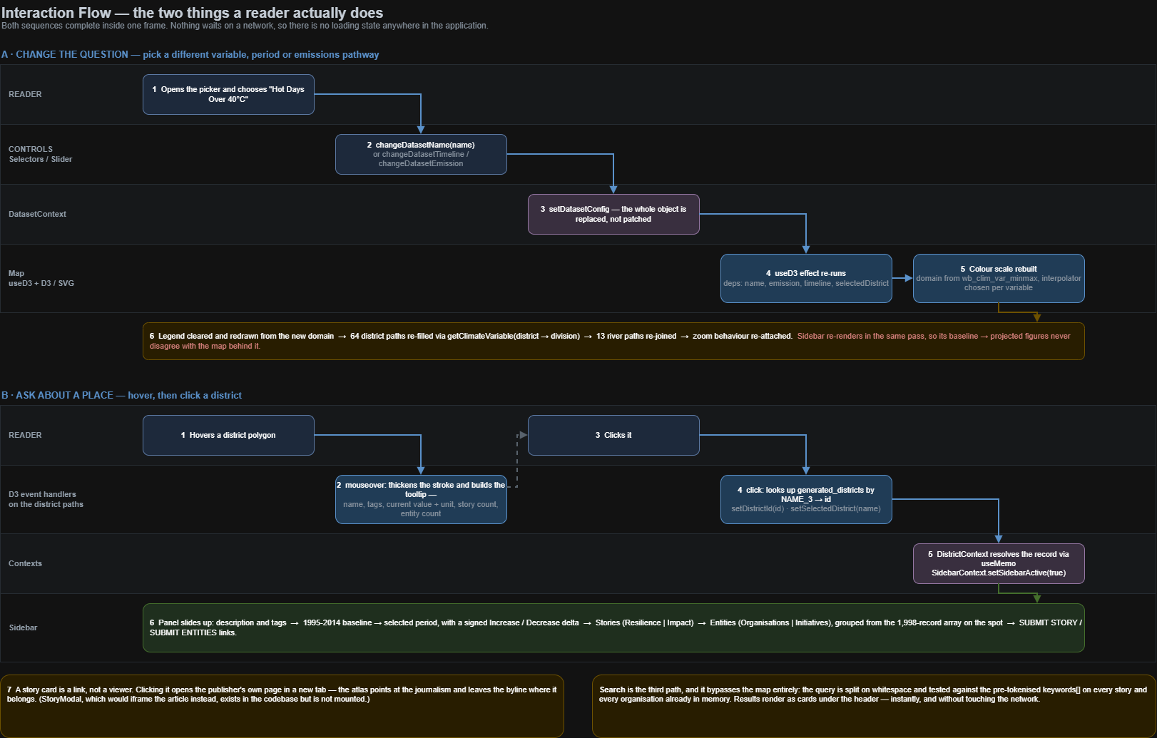 Open diagram ↗
The two journeys that matter: changing the climate question and asking for the story of a particular place.
I led the product architecture, data model, interaction design, geographic data preparation, and technical direction that brought the map, projections, stories, and organisation directory into one public experience.